Tasks — View Modes
The Tasks page supports two view modes: List View and Card View. You can switch between them using the view toggle in the toolbar.
List View
List View displays tasks in a traditional table format with sortable columns. This is the default view.
Each row shows key information at a glance — priority, title, status, deadline, and more. Click any row to open the Task Editor panel.
When the editor panel is open, the table narrows automatically. Some columns (Category and Created) are hidden in this compact mode to keep the layout readable.
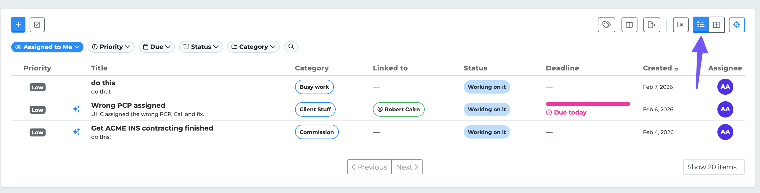
List View is best for scanning many tasks quickly and sorting by specific fields.
Card View
Card View displays each task as a visual card. Cards are arranged in a horizontal scrolling layout and show more detail at a glance than a table row.
Each card includes:
A colored left border indicating priority (red for High, blue for Medium, gray for Low)
The task title (with strikethrough if the task is closed)
A category badge
A priority badge (High, Medium, or Low)
A status badge with color coding
The linked individual's name (if any) — clickable to view their profile
A description preview (truncated to 80 characters)
The deadline with an urgency meter (progress bar showing how close the deadline is)
The assignee's name
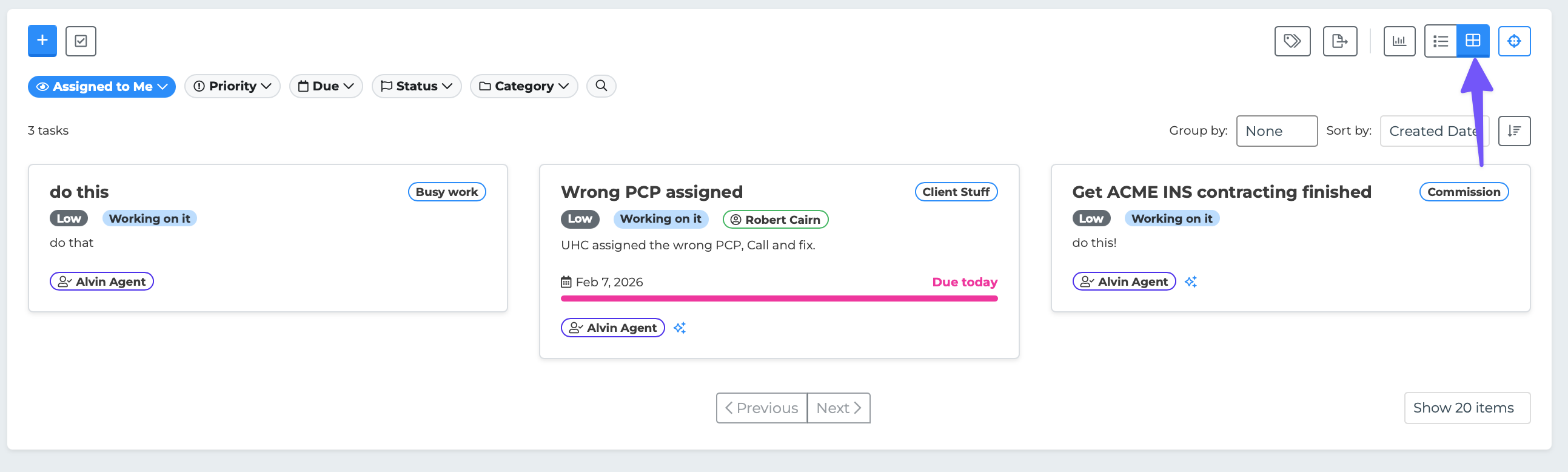
Sorting in Card View
In Card View, sorting works through a dropdown in the toolbar rather than column headers. You can sort by:
Deadline
Priority
Status
Title
Category
Each sort option can be toggled between ascending and descending order.
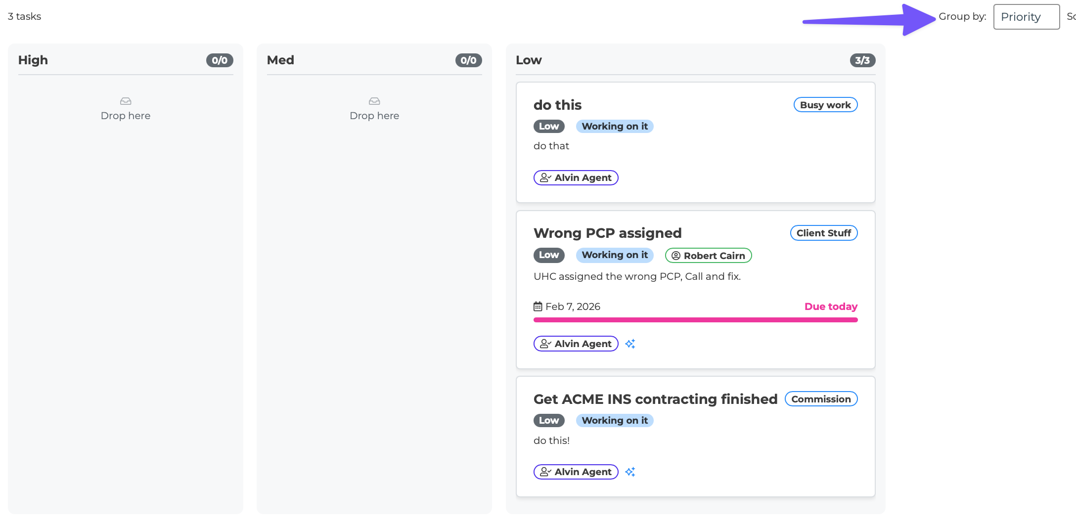
Board/Kanban View
On desktop, Card View supports grouping tasks into columns. Use the "Group by" option to organize cards by:
None — All cards in a single row (default)
Priority — Columns for High, Medium, and Low
Status — Columns for each status (Working on it, Waiting on Reply, etc.)
Assignee — Columns for each team member
When grouping is active, the layout becomes a Kanban-style board. You can drag and drop cards between columns to quickly change a task's priority, status, or assignee. Each column shows a count badge (e.g., "3/8") and a "Load More" button if there are more than 10 cards in that column.
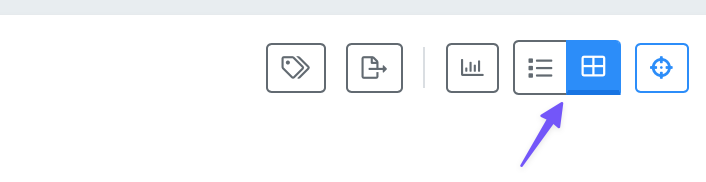
Switching Views
Click the view toggle icons on the right side of the toolbar:
The list icon switches to List View.
The grid icon switches to Card View.
Your preference is saved automatically and persists between sessions. The Column Settings button in the toolbar only appears when you are in List View, since Card View does not use table columns.